Friday was our first opportunity to have a bike tour in the city of Utrecht and really experience and see some of the infrastructures we had learned about the day before. It began with Ronald (the city planner we met with the day before) taking us out to a new suburb development in which they are bringing the same bicycle infrastructure out to so that occupants of the new neighborhood will still be able to use their bikes to get to work.


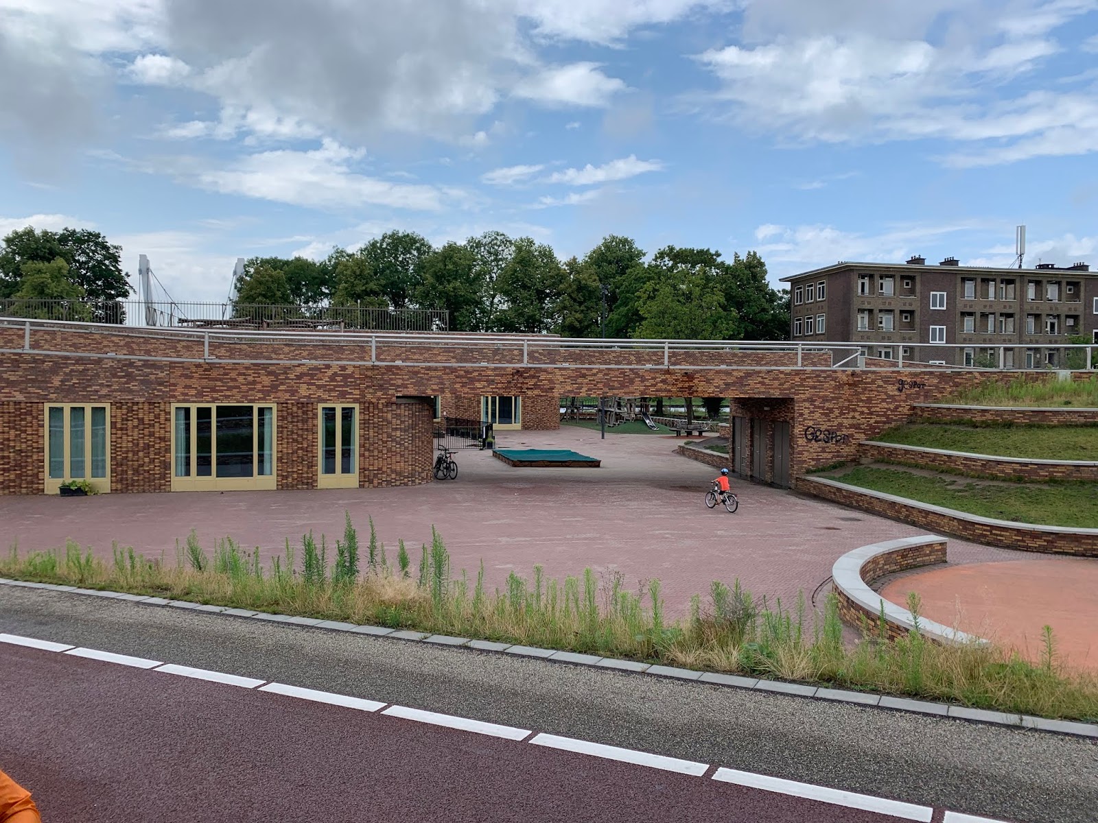
This use of space is amazing! Here they want to keep everything compact and dense so that it is possible to make rides from the burbs to the city center in 20 mins without a problem. In order to this, you can't waste any space. This design is a triple win. It gets bicyclists and pedestrians across the canal, it serves as a school, and it can also be used by the public for activity and fun. The way designers and planners get every last drop out of the areas in which they work here, is simply amazing.
After Ronald showed us this masterclass of design he took us to two areas of the city in which there was little to no transportation infrastructure put in place. First, we started at the town square in between the church and bell tower (two famous landmarks in Utrecht). Here Ronald explained that the combination of history on the site and the idea that people might be able to use their intuition to figure out how to get across the square (whether it be on foot, bike, or car) led the city to not use any signs or markings directing traffic. Weirdly enough it works. This was a stark contrast to what I had been seeing throughout the trip so far. Everything seemed to designed with infrastructure down to the very last inch. In this square doing nothing actually reduced car traffic going through which makes it a more comfortable place for people walking through, sitting down, biking, or just admiring. And when cars do come through they seem to be on their best behavior because they need to be paying the utmost attention. Here's a video of how the square was used midday.
Today learned how often the designers and planners here are thinking outside of the box. I never would have thought that taking all the signs and markings out of an intersecting could make it safer... but I would have been wrong. I'm not saying that stuff like this would work in every situation, but the willingness to try new things in order to find out what works best is enviable.

This new development was across the canal, so of course, they had to build a new and beautiful pedestrian bridge in order to connect the cyclists to the city.

This bridge did not only act as a bridge either. The turned the base of the bridge as well as the bike ramp down into a small elementary school complete with a playground and basketball court.

After Ronald showed us this masterclass of design he took us to two areas of the city in which there was little to no transportation infrastructure put in place. First, we started at the town square in between the church and bell tower (two famous landmarks in Utrecht). Here Ronald explained that the combination of history on the site and the idea that people might be able to use their intuition to figure out how to get across the square (whether it be on foot, bike, or car) led the city to not use any signs or markings directing traffic. Weirdly enough it works. This was a stark contrast to what I had been seeing throughout the trip so far. Everything seemed to designed with infrastructure down to the very last inch. In this square doing nothing actually reduced car traffic going through which makes it a more comfortable place for people walking through, sitting down, biking, or just admiring. And when cars do come through they seem to be on their best behavior because they need to be paying the utmost attention. Here's a video of how the square was used midday.
The second site Ronald brought us to was similar in the fact that there was nearly no signage or marking to show people going through what to do. But different as well because they actually redesigned this intersection to be this way. Previously this intersection was very large and had two lanes meant for cars to go through from either direction. If you were turning into it, you would be coming into a family neighborhood. In order to make it safer, they took out all the signs and markings, added massive planters and made it more pedestrian and cyclist-friendly overall. This process not only made it safer but calmed the traffic and made the area look better. Another triple win for the city of Utrecht.
Today learned how often the designers and planners here are thinking outside of the box. I never would have thought that taking all the signs and markings out of an intersecting could make it safer... but I would have been wrong. I'm not saying that stuff like this would work in every situation, but the willingness to try new things in order to find out what works best is enviable.
Comments
Post a Comment